House of Men
House of Men
Marenne Welten
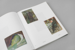
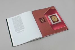
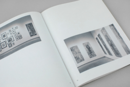
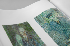
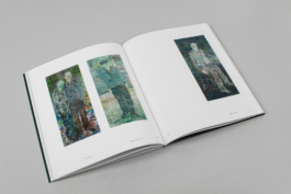
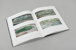
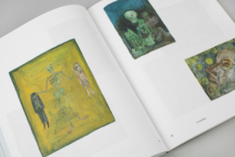
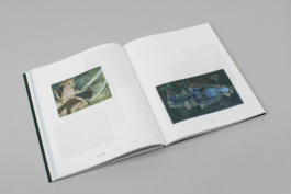
For House of Men, Dutch artist Marenne Welten delved into the history of the Stedelijk Museum Breda building that, for centuries, served as a home for the elderly men of Breda. Inspired by its history and the religious climate in Brabant at the time, Welten made new work: a series of life-size fictional portraits next to groups of intimate gouaches and collages related to the men’s life. The artist also selected objects from the archive and museum collection that were given a place among her visual work.
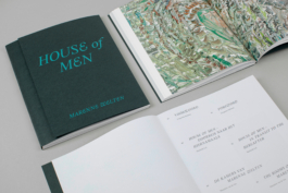
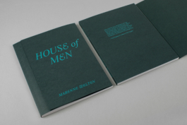
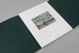
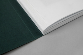
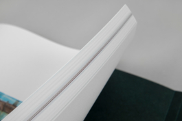
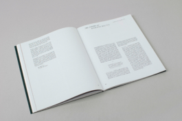
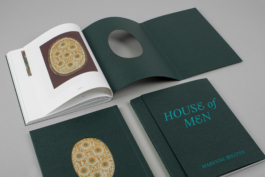
It’s like leafing through an old photo album. What you see is distant in terms of time, yet it’s familiar, like cherished memories. This idea has been reinforced by the binding featuring a fore-edge flap that has to be opened before the content unfolds. In earlier centuries the fore-edge flap was a typical element providing protection to the book when closed. The backcover with its die-cut detail, however, reveals one of Welten’s collages.
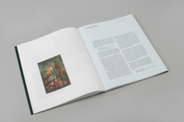
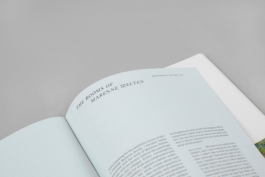
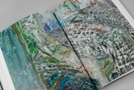
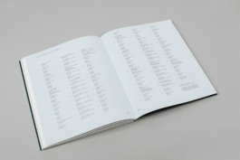
The colour palette of dark green and bright teal for the cover and pale blue for the text pages are taken from the rich tones within Welten’s paintings. Body text is set in Kleukens-Egyptienne (Forgotten Shape) in combination with WT Kormelink Italic (Wise Type) for captions and titles that feature a range of beautiful ligatures and swash capitals.
Year: 2022
Client: Marenne Welten
Co-publisher: Stedelijk Museum Breda
Artist publication, 21.0 × 26.5 cm, 112 pages
Photography: © The Book Photographer
House of Men
House of Men
Marenne Welten
For House of Men, Dutch artist Marenne Welten delved into the history of the Stedelijk Museum Breda building that, for centuries, served as a home for the elderly men of Breda. Inspired by its history and the religious climate in Brabant at the time, Welten made new work: a series of life-size fictional portraits next to groups of intimate gouaches and collages related to the men’s life. The artist also selected objects from the archive and museum collection that were given a place among her visual work.
It’s like leafing through an old photo album. What you see is distant in terms of time, yet it’s familiar, like cherished memories. This idea has been reinforced by the binding featuring a fore-edge flap that has to be opened before the content unfolds. In earlier centuries the fore-edge flap was a typical element providing protection to the book when closed. The backcover with its die-cut detail, however, reveals one of Welten’s collages.
The colour palette of dark green and bright teal for the cover and pale blue for the text pages are taken from the rich tones within Welten’s paintings. Body text is set in Kleukens-Egyptienne (Forgotten Shape) in combination with WT Kormelink Italic (Wise Type) for captions and titles that feature a range of beautiful ligatures and swash capitals.
Year: 2022
Client: Marenne Welten
Co-publisher: Stedelijk Museum Breda
Artist publication, 21.0 × 26.5 cm, 112 pages
Photography: © The Book Photographer
